OpenZhenZhen AI 提示词画廊 · gpt-image-2.5 · image
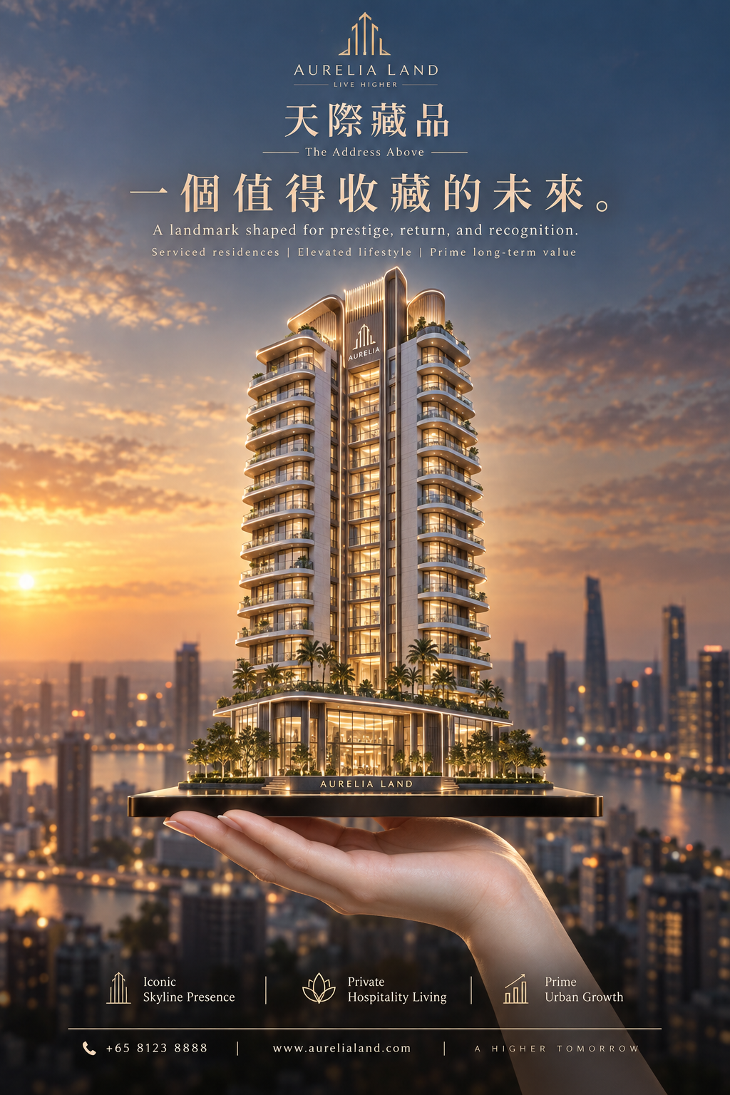
AURELIA LAND云曜天际房产海报设计
Aurelia Land: Cloud-Glow Skyline Real Estate Poster
来自 OpenNana 的图像提示词,已按本地图像分类和站点 gpt-image-2.5 归类整理。 使用时需上传人物参考图;本流程使用统一参考人物生成示例。
提示词 / Prompt
中文提示词
以用户上传的参考图作为主要可见人物的面部身份依据。在不与身份参考冲突的情况下,保留来源的场景、造型、服装、姿势、构图、光线和视觉风格。 Create a premium vertical flagship real-estate advertising poster for a fictional luxury property developer brand called AURELIA LAND, promoting its iconic serviced-residence tower project “云曜天际” with the English subtitle “The Address Above”. The image must merge Orbit-style upward momentum with Transit-style editorial restraint, while making the brand memory unmistakably strong through a singular architectural identity, a disciplined logo system, and a high-recognition visual symbol. The building must remain the absolute visual hero. Core concept: A refined luxury high-rise tower rises from a razor-thin dark premium platform resting on a realistic adult human hand in the lower foreground. The hand symbolizes ownership, elevation, and control, but remains secondary. The main brand memory device is the tower itself: it must have a distinctive signature silhouette with elegant stepped balcony bands and a recognizable crown profile, so the architecture becomes an instantly identifiable brand icon. The entire poster should feel like one unforgettable commercial symbol: a branded tower held above the city. Composition: Vertical poster, highly centralized composition, strong symmetry with subtle premium asymmetry in light and skyline depth. The tower stands at exact center, occupying the visual core and extending upward into generous negative space. The platform is thin, dark, glossy, and engineered, acting like a luxury pedestal-device hybrid. A realistic hand supports the platform from below, emerging from the lower edge with correct anatomy and understated presence. The upper half contains a tightly controlled premium typography system with clear brand hierarchy. The lower section contains only a reduced, elegant information structure. No clutter. Orbit direction: Strengthen the feeling of ascent and elevation. The tower should feel as if it is being presented upward toward the sky, with balcony lines, facade rhythm, lighting gradation, and podium geometry all guiding the eye vertically. The silhouette should become slimmer and more luminous toward the upper levels. Palm trees, podium lighting, and platform perspective should subtly reinforce an upward lift. The visual energy is not chaotic; it is a calm, prestigious rise. Transit restraint: Keep the layout extremely clean and premium. Remove all unnecessary decorative elements, excessive text blocks, or busy urban distractions. The skyline in the background is soft, blurred, and minimal. The poster should read in one second: brand, tower, aspiration. Typography must be sparse, measured, and elegant. Every element should feel expensive, intentional, and globally marketable. Architecture: An internationally upscale 14-to-16-story luxury serviced-residence tower with a highly memorable form: sculpted stepped terraces, continuous wraparound balconies, warm interior light, floor-to-ceiling low-iron glass, champagne-bronze frame accents, pale limestone or travertine surfaces, transparent corner glazing, and a refined hospitality-style podium with double-height lobby glass. The crown should have a distinctive final-tier expression, elegant but instantly recognizable. The tower must look architecturally credible, developer-grade, investment-worthy, and beautifully buildable. Brand identity emphasis: Create a strong, cohesive visual branding system. At the very top, place a minimal geometric logo mark derived from the tower’s silhouette, paired with the brand name AURELIA LAND in a refined luxury wordmark. Introduce one restrained signature brand accent color, muted champagne gold, repeated only in the logo mark, one key headline word, and a thin divider line, so the identity becomes memorable without becoming noisy. The tower silhouette, logo form, and balcony rhythm should feel like one unified brand language. The image must not feel like a generic property ad; it must feel like a proprietary flagship campaign. Typography and layout: Use original, premium, restrained text only. Top: the AURELIA LAND logo system. Below: project name “云曜天际”. Main Chinese headline: “一座被记住的天际资产”. Smaller English line: “A landmark shaped for prestige, return, and recognition.” Add one ultra-minimal descriptor line beneath: “Serviced residences | Elevated lifestyle | Prime long-term value”. At the bottom, reduce to three concise icon-led selling points such as “Iconic Skyline Presence”, “Private Hospitality Living”, “Prime Urban Growth”, followed by a clean, narrow contact strip. Typography should be spacious, balanced, high-end, and clearly subordinate to the architecture. Lighting: Golden sunset transitioning into early dusk, with soft radiant sky light, warm architectural interior glow, controlled highlights on metal trims and balcony slabs, and subtle rim light around the tower silhouette. The light should help the tower separate cleanly from the background and amplify its brand-icon status. Strong but elegan
English prompt
Use the uploaded reference image as the facial identity reference for the main visible person. Keep the source scene, styling, clothing, pose, composition, lighting and visual style unless they conflict with the identity reference. Create a premium vertical flagship real-estate advertising poster for a fictional luxury property developer brand called AURELIA LAND, promoting its iconic serviced-residence tower project “云曜天际” with the English subtitle “The Address Above”. The image must merge Orbit-style upward momentum with Transit-style editorial restraint, while making the brand memory unmistakably strong through a singular architectural identity, a disciplined logo system, and a high-recognition visual symbol. The building must remain the absolute visual hero. Core concept: A refined luxury high-rise tower rises from a razor-thin dark premium platform resting on a realistic adult human hand in the lower foreground. The hand symbolizes ownership, elevation, and control, but remains secondary. The main brand memory device is the tower itself: it must have a distinctive signature silhouette with elegant stepped balcony bands and a recognizable crown profile, so the architecture becomes an instantly identifiable brand icon. The entire poster should feel like one unforgettable commercial symbol: a branded tower held above the city. Composition: Vertical poster, highly centralized composition, strong symmetry with subtle premium asymmetry in light and skyline depth. The tower stands at exact center, occupying the visual core and extending upward into generous negative space. The platform is thin, dark, glossy, and engineered, acting like a luxury pedestal-device hybrid. A realistic hand supports the platform from below, emerging from the lower edge with correct anatomy and understated presence. The upper half contains a tightly controlled premium typography system with clear brand hierarchy. The lower section contains only a reduced, elegant information structure. No clutter. Orbit direction: Strengthen the feeling of ascent and elevation. The tower should feel as if it is being presented upward toward the sky, with balcony lines, facade rhythm, lighting gradation, and podium geometry all guiding the eye vertically. The silhouette should become slimmer and more luminous toward the upper levels. Palm trees, podium lighting, and platform perspective should subtly reinforce an upward lift. The visual energy is not chaotic; it is a calm, prestigious rise. Transit restraint: Keep the layout extremely clean and premium. Remove all unnecessary decorative elements, excessive text blocks, or busy urban distractions. The skyline in the background is soft, blurred, and minimal. The poster should read in one second: brand, tower, aspiration. Typography must be sparse, measured, and elegant. Every element should feel expensive, intentional, and globally marketable. Architecture: An internationally upscale 14-to-16-story luxury serviced-residence tower with a highly memorable form: sculpted stepped terraces, continuous wraparound balconies, warm interior light, floor-to-ceiling low-iron glass, champagne-bronze frame accents, pale limestone or travertine surfaces, transparent corner glazing, and a refined hospitality-style podium with double-height lobby glass. The crown should have a distinctive final-tier expression, elegant but instantly recognizable. The tower must look architecturally credible, developer-grade, investment-worthy, and beautifully buildable. Brand identity emphasis: Create a strong, cohesive visual branding system. At the very top, place a minimal geometric logo mark derived from the tower’s silhouette, paired with the brand name AURELIA LAND in a refined luxury wordmark. Introduce one restrained signature brand accent color, muted champagne gold, repeated only in the logo mark, one key headline word, and a thin divider line, so the identity becomes memorable without becoming noisy. The tower silhouette, logo form, and balcony rhythm should feel like one unified brand language. The image must not feel like a generic property ad; it must feel like a proprietary flagship campaign. Typography and layout: Use original, premium, restrained text only. Top: the AURELIA LAND logo system. Below: project name “云曜天际”. Main Chinese headline: “一座被记住的天际资产”. Smaller English line: “A landmark shaped for prestige, return, and recognition.” Add one ultra-minimal descriptor line beneath: “Serviced residences | Elevated lifestyle | Prime long-term value”. At the bottom, reduce to three concise icon-led selling points such as “Iconic Skyline Presence”, “Private Hospitality Living”, “Prime Urban Growth”, followed by a clean, narrow contact strip. Typography should be spacious, balanced, high-end, and clearly subordinate to the architecture. Lighting: Golden sunset transitioning into early dusk, with soft radiant sky light, warm architectural interior glow, controlled highlights on metal trims and balcony slabs, and sub
探索更多图片和视频提示词 · 生成图片 · 生成视频 · 在 AI 画布中创作
相关作品
- 装饰镜框中的客厅足球游戏之夜
四位成年朋友在舒适客厅中玩足球游戏,电视显示准确比分10–0;沙发上的玩家手持控制器,身后的朋友端着披萨,镜框构成画面层次。
- 鲜果破纸而出的三款饮料罐广告
一张三栏饮料广告三联画:依次呈现葡萄、石榴和芒果口味的330毫升铝罐。每只罐正面以清晰高对比文字逐字呈现指定英文或西里尔字母标签,保留en dash及所有拼写;横向撕纸效果露出对应鲜果。
- NORTHLINE户外概念品牌胶囊周边系列
一组为虚构户外探索品牌NORTHLINE设计的高端实用周边,以统一的森林绿、暖沙色和米白配色呈现保温水瓶、头灯、笔记本、充电宝、登山扣与防泼水收纳袋;每件产品均准确印有同一字样NORTHLINE。
- 模块化台灯演进概念工程信息图
一张9:16竖版模块化台灯概念设计演进信息图。中央为白底台灯渲染,周围环绕黑色工程线稿、箭头和局部草图;标题准确写作“Modular Desk Lamp”,角落标签准确写作“FORM STUDY”,时间轴仅含四个指定概念阶段,不表示真实历史。
- 等轴测视角科技产品拆解信息图
以45度等轴测角度展示一台无绳电钻的技术拆解信息图:左上标题框准确写作“cordless drill”,主体为无绳电钻而非手机或其他设备;剖面展示合理内部组件,并用简洁标注说明尺寸、材料与适用的功能流向。
- 手工纸艺中的祝贺人偶与同行寄语
一件方形手工纸艺作品摆在木桌上:原创成年卡通主持人形象从手绘纸片剪下并折成站立立体人偶,作抱拳祝贺姿势;旁边保留相配的空白剪影,并手写唯一固定寄语“与辉同行,不负韶华”(末尾无标点)。